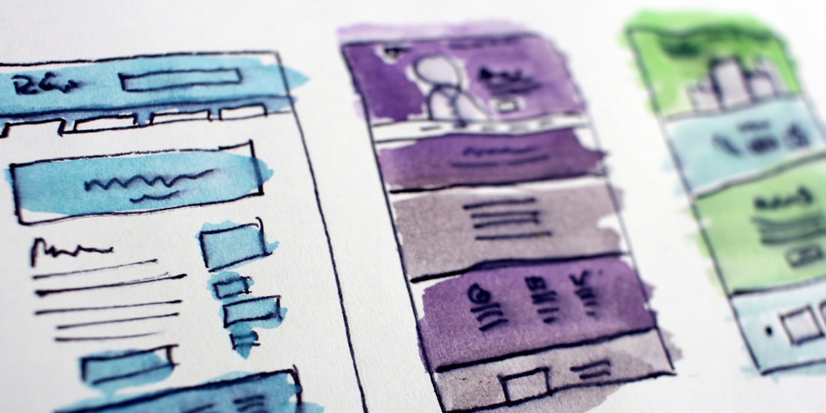
There are many sites that allow you to easily design your own website, or maybe you are trying your hand at building it from scratch. Uneven spacing, excessive wordage, and mismanaged sections detract from your site and can confuse the reader or turn off consumers. These common web design mistakes can be avoided to achieve the maximum potential from your site.
1) Insufficient Padding
This mistake is usually seen around headings and text in separate blocks. You might assume that too much padding around sections is inconvenient and makes the webpage unnecessarily long. In most cases, padding makes reading easier and better separates sections. You don’t want a user endlessly scrolling down your site, but there should be enough padding to show separation. Avoid skimping on padding to encourage a cleaner look that is easier to navigate.
2) Adding Extra Font Styles
For a cohesive site that looks polished, avoid using multiple font styles throughout your website. It is generally not a good idea to create a bold title with an italicized subheading or paragraph beneath it. Stick to the same font with one or two styles throughout the site. Consistent styling will appear more professional than a site with multiple fonts and an assortment of styles. Styling can be used effectively when done conservatively or with consideration to the style of the site as a whole.
3) Centering Long Paragraphs
Centering text is a popular method for sites because it looks clean and is eye-catching. However, avoid centering long paragraphs of text because this is difficult to read and makes the page look disorganized. Centered text is meant for short paragraphs with small amounts of text, and it is not meant to be used on every paragraph on the site.
4) Overwhelmed or Underwhelmed with Information
Sites that are crammed with information look very busy, are hard to navigate, and can turn off users. It is important to remember that white space is your friend when smoothing out a site and distributing information. You want the site experience to be enjoyable and flow systematically. Underwhelming sites take this too far; they have far too much whitespace and not enough information. This can lead to excessive scrolling and frustration for the user. Strive for a middle ground between the two, and create a site that has enough padding to separate sections cleanly without appearing too barren.
With these tips in mind, you will be able to make a few small adjustments to your site to appear more professional and increase appeal to users. It is essential to find a balance in your site, so each page appears cohesive and flows naturally. Remember that these tips are general guidelines, and exceptions can always be made if you feel it is to the benefit of the site and user experience.


Comments: 0